Ask a first-time author what matters most in publishing a book, and most will say the writing, then the cover. Formatting rarely makes the list — it feels like a technical afterthought, something a word processor handles automatically. In practice, formatting is one of the most consistently underestimated factors in how a book is actually received, and understanding why book formatting matters is worth the same attention authors give editing and cover design.
What “Formatting” Actually Covers
Book formatting means preparing a manuscript’s interior layout for its final published form: margins, font choice and sizing, line spacing, chapter heading style, page numbering, headers and footers, and how the text flows differently in print versus ebook formats. It’s distinct from editing (which addresses the words themselves) and cover design (which addresses the outside) — formatting is entirely about how the text is presented on the page or screen.
Why It Matters More Than Authors Expect
Formatting works invisibly when it’s done well and glaringly when it’s not. Readers rarely consciously notice good formatting — clean margins, readable font sizing, consistent spacing simply feel unremarkable, the way a well-made chair simply feels comfortable. But readers absolutely notice bad formatting: inconsistent spacing, awkward page breaks, fonts that strain the eyes, chapter headings that look different from one chapter to the next. That noticing translates directly into perceived professionalism, and perceived professionalism translates into trust in the book itself.
The Real Cost of Poor Formatting
- Reviews. Formatting errors are among the most commonly cited complaints in negative reviews for self-published books — mentioned even by readers who otherwise enjoyed the story, because it undercuts their confidence in the whole package.
- Reader trust. A poorly formatted interior signals amateur production values before a reader has even judged the writing, creating a credibility gap the content then has to work harder to overcome.
- Retailer rejection. Major platforms including Amazon KDP and IngramSpark have specific formatting requirements; files that don’t meet them get bounced back for correction, delaying launch.
- Reading experience. Poor formatting is genuinely harder to read — cramped margins, inconsistent line spacing, and awkward page breaks create friction that pulls readers out of the story or argument, even when they can’t articulate exactly why.
Print Formatting vs. Ebook Formatting
These are genuinely different disciplines, not the same file adjusted slightly. Print formatting is fixed-layout — every page break, widow, and orphan line is set in stone once it goes to the printer, so it has to be checked meticulously in its final form. Ebook formatting is reflowable — the text adapts to different screen sizes and font settings a reader chooses, which means formatting has to work correctly across a range of possible display conditions rather than one fixed page. A manuscript formatted well for print isn’t automatically well-formatted for ebook, and vice versa — both need their own dedicated pass.
A Side-by-Side Comparison
It’s easier to see why formatting matters by comparing two versions of the same manuscript. A poorly formatted version might use default 1-inch margins regardless of trim size, inconsistent spacing between paragraphs, chapter titles in whatever font size felt right at the time, and page breaks that land wherever the text happens to end. A professionally formatted version of the identical text uses margins calculated for the book’s actual trim size (larger inside margins to account for the spine, so text doesn’t crowd the binding), consistent paragraph spacing applied as a style rather than set manually, uniform chapter heading treatment throughout, and deliberate control over where each chapter starts so a new chapter never opens on the bottom third of a page.
Read side by side, the poorly formatted version doesn’t look “wrong” in an obvious way — nothing is broken exactly — it just feels slightly off in ways that are hard to name. That’s precisely the problem: readers don’t file a mental complaint about margins, they just feel that something about the book seems a bit amateur, and that impression colors how they receive everything else, including writing quality they might otherwise have loved.
How Formatting Affects Perceived Book Length and Pricing
Formatting choices also affect something authors don’t always expect: perceived value. A print book with generous margins, appropriate line spacing, and a well-chosen font sits at a certain page count and physical thickness for its word count. Cramming text with tight margins and small fonts to reduce page count (and printing cost) often backfires — dense, crowded pages read as harder to read and cheaper-feeling, even when the word count and story are identical to a properly spaced version. Getting the balance right between economical printing and comfortable reading is itself part of what professional formatting weighs.
Common Formatting Mistakes First-Time Authors Make
- Using manual line breaks instead of proper paragraph styles — this looks fine in the original document but often breaks unpredictably when converted to ebook formats.
- Inconsistent chapter heading styles — chapter one uses one font size and spacing, chapter five uses another, because headings were formatted manually rather than with a consistent style applied throughout.
- Ignoring widows and orphans — a single word or short line stranded alone at the top or bottom of a page, which looks unpolished and is a hallmark of unprofessional formatting.
- Wrong trim size margins — using default document margins instead of margins calculated for the book’s actual physical trim size, which can crowd text near the spine or edge.
- Skipping a dedicated ebook conversion — assuming the print-formatted file will convert cleanly to ebook formats, when reflowable text often needs its own formatting pass entirely.
What Good Formatting Actually Involves
Professional formatting typically includes: selecting a font and size appropriate to the genre and trim size (with serif fonts remaining the standard for print fiction, sans-serif more common in certain nonfiction and digital-first formats), setting margins correctly for the specific trim size chosen, applying consistent paragraph and heading styles throughout rather than manual adjustments per chapter, checking every page for widows, orphans, and awkward breaks in the print version, and creating a separate, properly reflowable file for ebook formats with working navigation and a functional table of contents.
A Formatting Checklist Before You Publish
Whether you format your own book or hire a professional, this is roughly what should be checked before a manuscript is considered publication-ready:
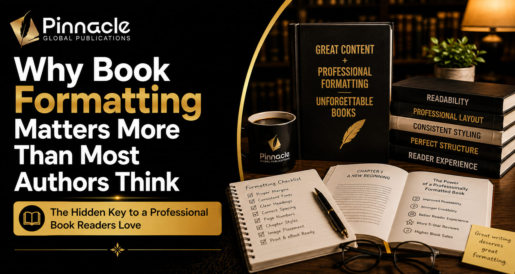
- Margins set correctly for the book’s actual trim size, not left at a word processor’s default
- Consistent paragraph indentation and spacing applied as a style throughout, not adjusted chapter by chapter
- Chapter headings using one uniform style — same font, size, and spacing on every chapter opener
- No widows or orphans — no single word or short line left stranded at the top or bottom of a page
- Page numbers present and correctly sequenced, with front matter (title page, copyright page) excluded or numbered separately per convention
- A working, accurately linked table of contents in the ebook version
- Front and back matter (title page, copyright page, dedication, author bio) formatted consistently with the rest of the book, not left in a plain default style
- A separate proofing pass specifically on the formatted file, since formatting itself can introduce new errors that didn’t exist in the unformatted manuscript
That last point matters more than it might seem — this is exactly why proofreading happens after formatting, not before: a proofreader checking the final laid-out pages catches formatting-introduced errors that simply don’t exist in an unformatted Word document.
Formatting for Different Genres and Book Types
Formatting conventions also shift somewhat by category. Fiction typically uses classic serif fonts, generous line spacing, and simple chapter headings that stay out of the way of the story. Nonfiction and business books more often incorporate subheadings, bullet points, callout boxes, and sometimes sidebar content — formatting choices fiction rarely uses, since nonfiction readers frequently skim and reference rather than read cover to cover. Children’s books and heavily illustrated nonfiction involve an entirely different layout discipline, coordinating text placement around artwork rather than flowing text through a simple template. Knowing which conventions apply to your specific book type is part of what separates formatting done with genre awareness from formatting applied generically regardless of what kind of book it actually is.
Why This Is Worth Paying a Professional For
Formatting software has gotten more accessible, and some authors format their own books successfully. But professional formatting catches the details a self-taught pass often misses — correct margins for the exact trim size, clean widow and orphan control throughout a 300-page manuscript, and an ebook file that actually navigates correctly across different devices and reading apps. Given how directly formatting affects reader trust and review sentiment, it’s one of the areas where the gap between amateur and professional execution shows up most visibly to readers, even though they usually can’t name what specifically feels off.
Frequently Asked Questions
Why does book formatting matter if the writing is good? Because formatting is what readers experience the writing through — poor formatting creates friction and signals amateur production before a reader has fully engaged with the content, undercutting an otherwise strong manuscript.
What’s the difference between editing and formatting? Editing addresses the words themselves — grammar, clarity, structure. Formatting addresses how those words are laid out on the page: margins, spacing, typography, and page breaks.
Do I need separate formatting for print and ebook? Yes — print formatting is fixed-layout and ebook formatting is reflowable, which means they require genuinely different technical approaches, not just a converted version of the same file.
Can formatting mistakes get my book rejected by retailers? Yes — major platforms like Amazon KDP and IngramSpark have specific technical formatting requirements, and files that don’t meet them are returned for correction before publication can proceed.
Is it worth paying for professional formatting if I’m on a budget? It’s one of the more affordable stages of book production relative to editing or cover design, and the visible difference in reader experience and review sentiment often makes it a high-value investment even on a tight budget.
Getting Your Book Properly Formatted
Good formatting is invisible when done right, which is exactly why it’s so easy to underestimate until a book’s reviews start mentioning it. A professional book formatting service handles both print and ebook formatting correctly from the start, checking the details — margins, spacing, widows and orphans, retailer requirements — that separate a book readers trust from one that quietly undermines itself. Reach out if you’d like your manuscript formatted properly for both formats before it goes live.